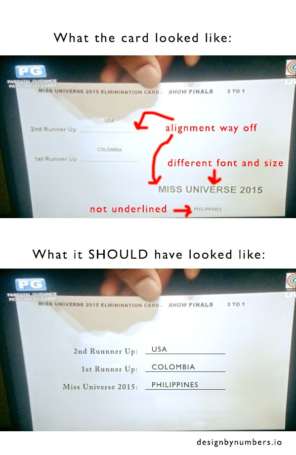
Bad design is one issue that people pointed out, which could have caused the incorrect announcement of this year’s Miss Universe.
In relation with this, Alex Rodriguez posted a photo on Facebook on how the Miss Universe 2015 announcement card looked like, which many believed has caused the confusion. Below it is how the announcement card should have looked to possibly prevent any confusion.
Take a look below.
For us, the card below looks a little less confusing that the one above.
Do you agree? If not, how could the confusion be avoided?


the issue is not the english or the grammar…it is on the cue card. ..the format of presenting results (of the contest) on the cue card….the concern and issue on the look of the card, doesn’t really matter,… to avoid mistake, the host should focus to his function and concentrate on his job,… READ PROPERLY AND CAREFULLY WHAT IS WRITTEN (on the card), AND ANNOUNCE CLEARLY and CORRECTLY THE REAL AND TRUE CONTENT OF THE CUE CARD.
what should it look like, the format, the size of the card, the color, the shape, the font…doesn’t matter. What is important…JUST READ IT PROPERLY AND CORRECTLY…!!!!