When talking about the skills needed to maintain a blog, I often hear people talking about writing, photography, and social media management. An often overlooked skill is graphic design. As a blogger, I have the hardest time with graphic design—but I do acknowledge its importance. How many times has an article looked more appealing because of an added infographic? How many times have we clicked on an article from our Facebook news feed just because the featured photo looked interesting? Effective graphic design is important.
I asked help from graphic designer Ken Benitez to share his thoughts on fonts, colors, and the most helpful tools that help him in his craft.
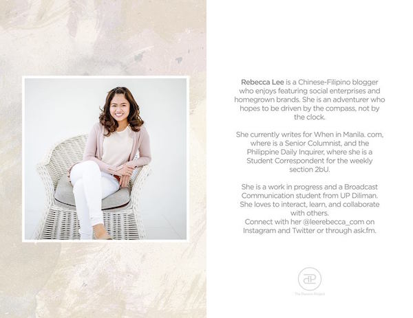
Filipino graphic designer Ken Benitez
Ken Benitez merges a creative vision with stunning design solutions. As a freelance graphic artist based from the Philippines, he has found inspiration in his love for the arts since childhood, and has allowed that passion to evolve with him both professionally and personally. His visionary style has an emphasis on clean, simple, and modern design with components that are both distinctive and unforgettable. His signature style is complex and nuanced, and his many talents are flexible and tailored for the needs of each project. His expertise in logo design and identity branding lend themselves well to brands seeking elegant and memorable graphic designs that will please almost any aesthetic preferences. For beautiful marketing materials to fit any canvas from small to large, Ken Benitez develops timeless and memorable concepts.
As proof of Ken’s skill, you only have to look at his portfolio and his list of clients, which includes Jason Magbanua! I enlisted Ken’s services to work on the branding of my blog, and I’m extremely satisfied with the results.
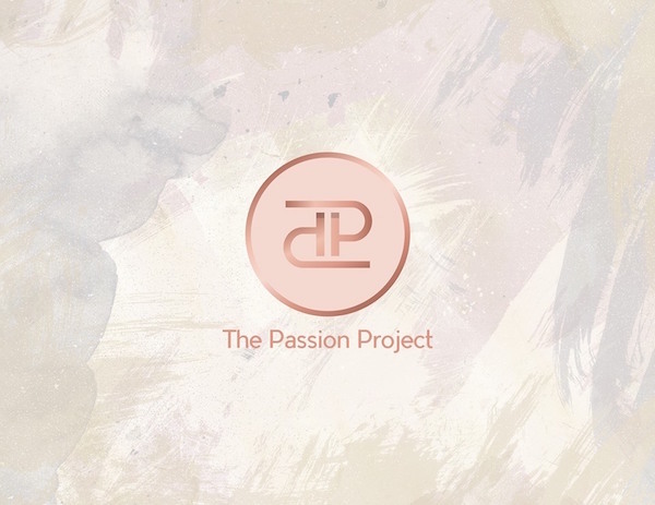
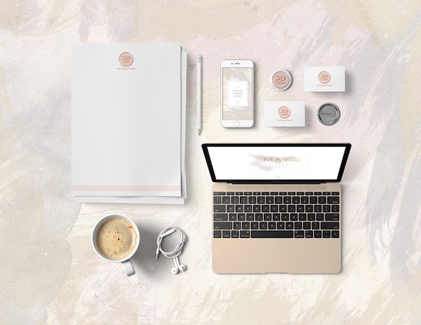
Just for background, these are the some of the things that Ken came up with for my blog. For this project, I wanted the new logo to be more classy, timeless, professional, comfortable and approachable. I’ve always been a fan of watercolor designs and rose gold, so Ken applied it in my letterhead and online collaterals.
(In case you’re interested to see how my mood board for this project was like (and how Ken totally transformed it!), this is the link to my Pinterest mood board. And this is what my blog looks like now!)
5 Branding Tips from Graphic Designer Ken Benitez
1.) The real work begins long before the actual making of the design.
Ken says, “Before meeting with a client, I prepare a questionnaire for him regarding his project to be able to know what type of business, product or service, target market, competition, personality and specific color he is considering. This process will allow me to choose the appropriate color/s for the brand.”
Preparing mood boards also help. What are the key visual reminders that you associate the most with your brand? It may be overwhelming to immediately identify specific colors and fonts. But if you put all your pegs in a mood board, you slowly visualize what you like and don’t like.
2.) Choose two to three colors that complement each other and the put forward message you want to convey.
For successful branding, you wouldn’t want a very cluttered logo that’s exploding with different colors! It’s also best to research on color theories—what messages different colors convey, and which colors complement each other.
Ken says, “In choosing colors for a logo, I usually pick two to three colors. Choosing colors for the logo/poster must complement with the concept of the project. One thing I normally do is make a research on the chosen colors, since they have different theories and meanings. Choosing the right combination of colors is one major key to having an effective marketing communication.”
3.) Choose fonts that are readable, but always add contrast.
This should be a no-brainer, but you’d be surprised at how many logos out there use trendy fonts that aren’t readable. This is Ken’s first rule when it comes to fonts. “In choosing fonts, my number one rule is, fonts have to be readable.”
Ken’s personal preference is usually combining the family font of sans serif and serif. But to add dimension and variety to the design, Ken makes sure that there is still contrast. “I also create contrast of the font through style, size, weight, spacing, and color.”
4.) Maximize free tools online. Join talks and workshops offline.
Ken already mentioned that he regularly researches on color theories online. He recommends using Coolors.co, “for faster way in making choices in colors for your logo/graphic design.”
Ken is also a frequent user of Pinterest and Behance. He uses those to help him find pegs and inspiration.
Ken shares where his journey with graphic design began. “My passion and love for arts started since I was a child. I guess I have inherited some talents from my grandmother who was a natural born artist. I remember one time I drew my grandfather’s face using only Microsoft Paint and it really looked like him. My relatives said I was good and that I should enhance my talent. It gave me a boost. In high school, we had a subject on Adobe Software and it tickled my interest. From then on, I would make portraits of my relatives & friends using different methods until I learned how to vectorize them. As soon I graduated from college (by the way I took Agriculture) I started working for my grandfather’s business, which is an offset printing press. I worked as a graphic artist. I became more knowledgeable in printing technicalities (color, proper layouting, gang up, color separation stuff etc.) and how to deal with clients.”
Later on, I took a workshop at Philippine Center for Creative Imaging (PCCI) and Manila Workshops (Talino Talks 101) about Logo Design & Branding. From there I gained knowledge more on branding and graphic designs.”
5.) Take creative breaks to be inspired by other platforms and to network.
Aside from being a graphic designer, Ken is also a lifestyle and wedding onsite editor for Team Benitez Photo (www.teambenitezphoto.com). Ken shares that his work in weddings give him much-needed breaks. “Sometimes, I need to take a break and go somewhere to regain my focus, creativity and find inspiration,” Ken said. Through his work in the wedding industry, he has gained good friends, travelled to different places. He also got to meet many of his clients there.
Ken has dealt with different clients, both from the Philippines and from abroad. When asked about his most fulfilling experiences, he shared, “Knowing that they are happy and satisfied with the outcome of their projects. And much more when they refer me to their friends and colleagues. I have a client in the Philippines who once referred me to his friend in New Zealand. The latter contacted me and asked me to design his business logo which is Real Estate Business. He was very satisfied with it, now I’m designing a logo for his other company. Some of my idols in the wedding industry became my clients – Paul Vincent and Jason Magbanua. I have so much respect for them since they are so popular and really excel in their fields. I designed Paul Vincent Photography’s logo and 15 years logo for Jason Magbanua for his first wedding videography workshop here in the Philippines. And they too, referred me to their friends. It is a chain reaction and instant marketing. That is very fulfilling!”
If you have more questions for Ken, just leave a comment below!
Ken Benitez Graphic
Facebook: www.facebook.com/kenbenitez
Instagram: @ken_benitez
Email: kenbenitezgraphics@gmail.com
Contact Number: +63 917 538 1450
Website: www.kenbenitezgraphics.com


