Beyond the pretty colors and decor, ARMYs know for a fact that each BTS album comes with a story. Their newest album “Map Of The Soul: 7” is no exception to that.
#BTS #방탄소년단 MAP OF THE SOUL : 7 Concept Photo Sketch #1 @ (https://t.co/Mgsl0fwT4v) pic.twitter.com/O6cqOs2r8X
— BTS_official (@bts_bighit) February 14, 2020
According to Sparks Edition, the duo who designed their albums, each one of the four designs of their current album has a specific meaning related to BTS and their journey. First off, the “7” logo in itself was put together by combining 7 unique fonts— each one chosen by a different member to represent themselves. These were then imposed over each other, signifying their journey as a group of 7 over 7 years.
Each version of the album has its own unique meaning, too— one borne from watching countless videos of BTS’s videos, along with the fan-made compilations.
“Since we needed to establish a story for each member, we tried to study them like a geek,” Jang Joon Oh, designer and one of the halves that form Sparks Edition, said.
Thus, the four unique covers were created. Beyond the colors and abstract shapes, Sparks Edition intentionally overlaid and colored each version in different ways to represent the different sides of BTS:
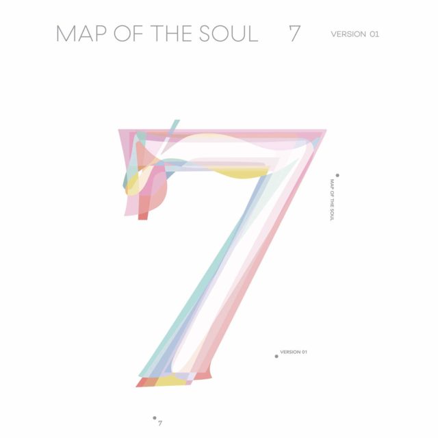
Photo from Sparks Edition/Big Hit Entertainment
Version 1: a pastel color scheme based on swans. Although a stark contrast from their “Black Swan” music video, it represents the same themes— the quest for perfection, innocence, and vulnerability.
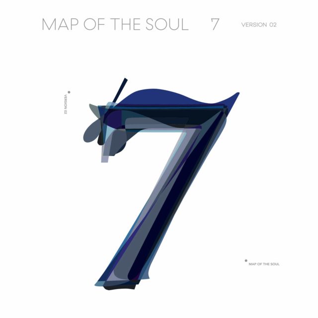
Photo from Sparks Edition/Big Hit Entertainment
Version 2: a dark and monochromatic color scheme also representative of swans – the black swan, that is. A more curvy “7” shape compared to its predecessor, this one represents their glamorous shadows.
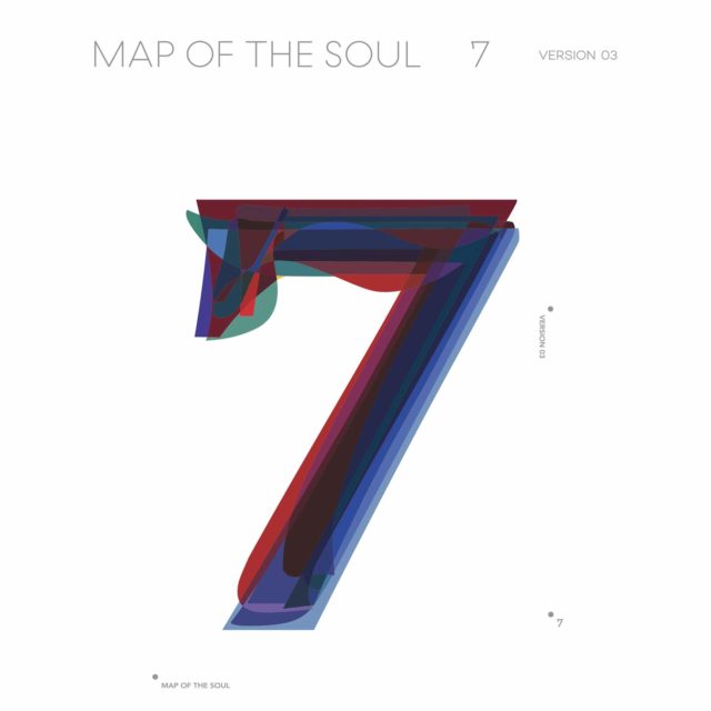
Photo from Sparks Edition/Big Hit Entertainment
Version 3: bold red, blue, and black colors— much like the colors of South Korea’s flag. It shows their patriotism and sense of duty. The “7” is straight and rigid, signifying strength.
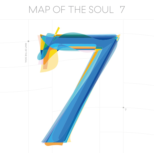
Photo from Sparks Edition/Big Hit Entertainment
Version 4: a colorful and artfully arranged version that represents harmony. This was designed to showcase the group’s unity, ego, and identity.
A Ji Hye, the other half of Sparks Edition, adds that “it’s the simplest design we’ve worked on in a way, yet has the most stories in it.” We couldn’t agree more.
What are your thoughts on the new BTS album covers?
Do you have a story for the WhenInManila.com Team? Email us at story.wheninmanila@gmail.com or send us a direct message at WhenInManila.com Facebook Page. Interact with the team and join the WhenInManila.com Community at WIM Squad!


